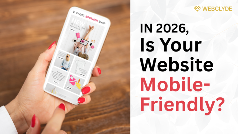
Turn Visitors into Paying Customers with a Mobile-Friendly Website
If your website isn’t mobile-friendly website for local businesses, you’ll miss sales. By 2026, over 70% of local searches will be on mobile. Most customers won’t find your business otherwise.
WebClyde has helped local businesses recover lost revenue by improving their mobile sites. You can achieve the same results by making your website mobile-friendly. Next, let’s look at why optimizing for mobile is no longer a choice, but a necessity.
Why Mobile Optimization Is No Longer Optional
Google uses mobile-first indexing. Your site’s quality and speed now depend on mobile performance.
60% of users leave if sites load in more than 3 seconds (Akamai)
- 85% won’t recommend a business if the mobile site is clunky (Google)
- 95% of “near me” searches happen on mobile
“Mobile isn’t an add-on. For local businesses, it’s the front door.” – Luke Wroblewski, Mobile UX Expert.
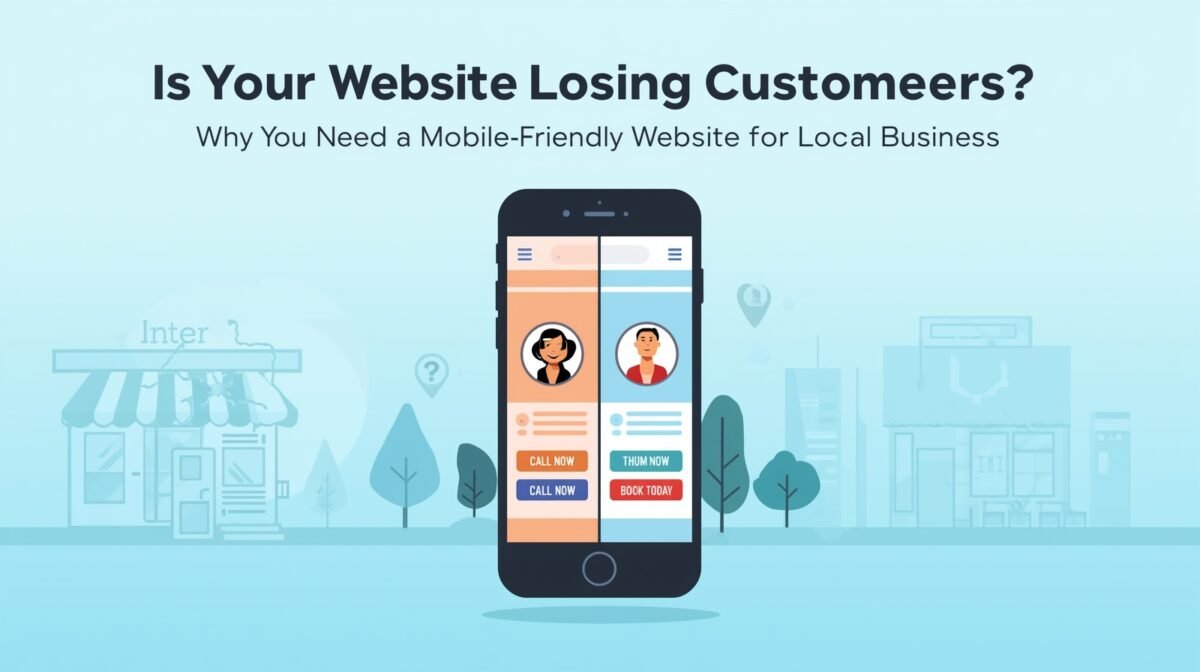
If visitors can’t tap to call, find your address, or book quickly, they’ll leave and contact your competitor instead.
3 Deadly Mobile Mistakes Killing Your Local Business Website
1. Non-Responsive Design
When desktop sites are viewed on mobile devices, text can overlap, menus may disappear, and images may stretch out of place.
Fix:
- Use responsive frameworks like Bootstrap or Tailwind.
- Test with Google’s Mobile-Friendly Test
2. Tiny Tap Targets
Small buttons or hidden calls to action make it harder for visitors to take action.
Fix:
- Enlarge buttons (“Call Now”, “Book Today”)
- Place actions in the thumb zone (bottom third of the screen)
- Add spacing between links.
3. Slow Load Speed
Large images and unnecessary code can slow down your site and cost you sales.
Fix:
- Convert images to WebP.
- Enable lazy loading for below-fold content.
- Use Cloudflare CDN, minify CSS/JS
- Target Largest Contentful Paint under 2.5s
“Speed isn’t a luxury; it’s the price of entry.” – Florian Culmann, Web Performance Specialist.
Want to get started? Here are the steps to create a mobile-friendly website:
Step 1: Audit Your Mobile Experience
- Google Mobile-Friendly Test
- PageSpeed Insights
- Hotjar Mobile Heatmaps
- Real-device testing (iPhone + Android)
Step 2: Implement Mobile-First Fixes
- Responsive layout to avoid horizontal scrolling
- Thumb-zone optimized CTAs
- Simplified navigation and sticky buttons
Step 3: Optimize for Local Users
- Click-to-call links and Google Maps integration
- Include city/service keywords (e.g., “Plumber in Austin”)
- Show hours, holiday closures, and contact info on all pages
Step 4: Track, Test, Repeat
Monitor in Google Analytics:
- Mobile bounce rate
- Conversion rate
- Session duration
Run A/B tests on:
- CTA color and placement
- Form length
- Hero messaging
“Mobile optimization is never ‘done.’ Test monthly; your customers’ habits change faster than your code.” – Jamie Park, UX Designer
Quick Self-Test for Your Mobile Site
Grab your phone and try:
- Understand what you offer in 5 seconds.
- Tap your main CTA without zooming.
- Call your business in 1 tap.
- Get directions in 2 taps.
- Submit a form in under 30 seconds.
If any of these steps don’t work, that’s likely where you’re losing customers.

Mobile-Friendly Checklist for Local Businesses
✔ Loads under 2.5s on 4G (site speed should be fast enough for users on mobile data)
✔ Clear headline and value proposition above the fold (users quickly understand your service)
✔ Sticky “Call” or “Book” buttons (essential action buttons always visible)
✔ Buttons are at least 44px with safe spacing (ensures easy tapping)
✔ Body text is at least 16px, line height 1.5 (readable on mobile screens)
✔ No horizontal scrolling (all content fits mobile screens)
✔ Click-to-call and Maps links on every page (easy to contact or find you)
✔ LocalBusiness schema markup (helps search engines display your business details)
✔ Minimal pop-ups, easy to close (reduces user frustration)
✔ Analytics segmented by mobile performance (track mobile-specific conversion and issues)
Your Mobile Website Is Your Online Storefront
A mobile-friendly site isn’t optional. It acts as your 24/7 salesperson and billboard. Improve speed, navigation, and make every action simple. You’ll see your business grow.
Request your FREE Mobile UX Audit and get a prioritized list of fixes within 48 hours.
Let us implement these fixes for you.
Turn your mobile visitors into customers with WebClyde’s mobile-first websites.